@rcaferati/react-awesome-button provides three related button components:
AwesomeButton— animated base buttonAwesomeButtonProgress— progress flow wrapper on top ofAwesomeButtonAwesomeButtonSocial— social/share wrapper on top ofAwesomeButton
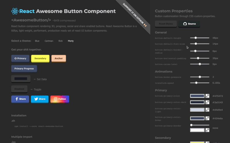
This README is updated for the current v8 build outputs (including theme CSS + theme module mappings).
npm install @rcaferati/react-awesome-buttonUse this when you do not pass cssModule. Import the base stylesheet once (e.g. in your app entry).
import React from 'react';
import { AwesomeButton } from '@rcaferati/react-awesome-button';
import '@rcaferati/react-awesome-button/styles.css';

export default function Example() {
  return <AwesomeButton type="primary">Button</AwesomeButton>;
}When you use a theme with cssModule, you must:
- Import the theme CSS (the actual rules)
- Import the theme module mapping object and pass it as
cssModule
import React from 'react';
import { AwesomeButton } from '@rcaferati/react-awesome-button';

// ✅ theme rules (CSS)
import '@rcaferati/react-awesome-button/themes/theme-blue.css';

// ✅ theme module mapping (JS/ESM)
import themeBlue from '@rcaferati/react-awesome-button/themes/theme-blue';

export default function Example() {
  return (
    <AwesomeButton cssModule={themeBlue} type="primary">
      Button
    </AwesomeButton>
  );
}If you use both patterns (some buttons with cssModule, some without), import both:
import '@rcaferati/react-awesome-button/styles.css';
import '@rcaferati/react-awesome-button/themes/theme-blue.css';
CommonJS note (rare): if you must
require()a theme, it returns the mapping object:const themeBlue = require('@rcaferati/react-awesome-button/themes/theme-blue');
If href is not provided, AwesomeButton renders button-like behavior and calls onPress on release.
import React from 'react';
import { AwesomeButton } from '@rcaferati/react-awesome-button';
import '@rcaferati/react-awesome-button/themes/theme-blue.css';
import themeBlue from '@rcaferati/react-awesome-button/themes/theme-blue';

export default function Example() {
  return (
    <AwesomeButton
      cssModule={themeBlue}
      type="primary"
      onPress={() => {
        // do something
      }}>
      Button
    </AwesomeButton>
  );
}If href is provided, it renders anchor-like behavior and lets native navigation happen.
import React from 'react';
import { AwesomeButton } from '@rcaferati/react-awesome-button';
import '@rcaferati/react-awesome-button/themes/theme-blue.css';
import themeBlue from '@rcaferati/react-awesome-button/themes/theme-blue';

export default function Example() {
  return (
    <AwesomeButton
      cssModule={themeBlue}
      type="primary"
      href="https://example.com"
      containerProps={{ target: '_blank', rel: 'noreferrer noopener' }}>
      Open website
    </AwesomeButton>
  );
}Use before / after to render icons.
For icon-only buttons, pass the icon using before and omit children.
import React from 'react';
import { Play, ArrowRight, Sparkles } from 'lucide-react';
import { AwesomeButton } from '@rcaferati/react-awesome-button';
import '@rcaferati/react-awesome-button/themes/theme-blue.css';
import themeBlue from '@rcaferati/react-awesome-button/themes/theme-blue';

export default function Example() {
  return (
    <div style={{ display: 'grid', gap: 12 }}>
      <AwesomeButton
        cssModule={themeBlue}
        type="primary"
        size="medium"
        before={<Sparkles size={16} aria-hidden="true" />}
        after={<ArrowRight size={16} aria-hidden="true" />}>
        Continue
      </AwesomeButton>

      {/* Icon-only button */}
      <AwesomeButton
        cssModule={themeBlue}
        type="primary"
        size="medium"
        before={<Play size={16} aria-hidden="true" />}
      />
    </div>
  );
}size="small" | "medium" | "large"→ fixed-size buttonsize={null}→ auto width (content-driven)
import React from 'react';
import { AwesomeButton } from '@rcaferati/react-awesome-button';
import '@rcaferati/react-awesome-button/styles.css';

export default function Example() {
  return (
    <div style={{ display: 'grid', gap: 12 }}>
      <AwesomeButton size="small" type="primary">
        Small
      </AwesomeButton>
      <AwesomeButton size="medium" type="primary">
        Medium
      </AwesomeButton>
      <AwesomeButton size="large" type="primary">
        Large
      </AwesomeButton>
      <AwesomeButton size={null} type="primary">
        Auto width grows with content
      </AwesomeButton>
    </div>
  );
}| Prop | Type | Default | Description |
|---|---|---|---|
type |
string |
'primary' |
Visual variant key (styled by theme/class names) |
size |
"small" | "medium" | "large" | null |
'medium' |
Size key or null for auto width |
active |
boolean |
false |
Controlled pressed/active visual state |
disabled |
boolean |
false |
Disables interactions |
visible |
boolean |
true |
Toggles visible state class |
placeholder |
boolean |
false |
If true and children is empty, renders placeholder/disabled state |
between |
boolean |
false |
Uses space-between layout for content (useful with icons) |
ripple |
boolean |
false |
Enables ripple effect on successful press release |
moveEvents |
boolean |
true |
Enables pointer move position classes (left/middle/right) |
href |
string | null |
null |
Enables anchor-like mode |
element |
React.ElementType | null |
null |
Custom root element component |
rootElement |
string |
'aws-btn' |
Base class prefix |
className |
string | null |
null |
Extra class names |
style |
React.CSSProperties |
{} |
Inline styles for root element |
containerProps |
object |
{} |
Additional props forwarded to the root element |
cssModule |
Record<string, string> | null |
null |
CSS module mapping (theme object) |
before |
React.ReactNode |
null |
Content rendered before label |
after |
React.ReactNode |
null |
Content rendered after label |
extra |
React.ReactNode |
null |
Extra content rendered inside wrapper (used by wrappers like Progress) |
children |
React.ReactNode |
null |
Main label/content |
onPress |
(event) => void |
null |
Called on press release/activation |
onPressed |
(event) => void |
null |
Called when press-in animation completes |
onReleased |
(element: HTMLElement) => void |
null |
Called when the release cycle is cleared |
onMouseDown |
(event) => void |
null |
Pointer/mouse/touch down callback |
onMouseUp |
(event) => void |
null |
Pointer/mouse/touch up callback |
AwesomeButtonProgress wraps AwesomeButton and manages a progress lifecycle.
Its onPress receives a second callback argument:
next(true)→ success flownext(false, 'Failed')→ error flow (optional label override)
import React from 'react';
import { AwesomeButtonProgress } from '@rcaferati/react-awesome-button';
import '@rcaferati/react-awesome-button/themes/theme-blue.css';
import themeBlue from '@rcaferati/react-awesome-button/themes/theme-blue';

const sleep = (ms) => new Promise((resolve) => setTimeout(resolve, ms));

export default function Example() {
  return (
    <AwesomeButtonProgress
      cssModule={themeBlue}
      type="primary"
      loadingLabel="Verifying…"
      resultLabel="Verified!"
      releaseDelay={500}
      onPress={async (_event, next) => {
        await sleep(900);
        next(true);
      }}>
      Verify
    </AwesomeButtonProgress>
  );
}import React from 'react';
import { AwesomeButtonProgress } from '@rcaferati/react-awesome-button';
import '@rcaferati/react-awesome-button/styles.css';
const sleep = (ms) => new Promise((resolve) => setTimeout(resolve, ms));
export default function Example() {
return (
<AwesomeButtonProgress
type="danger"
loadingLabel="Publishing…"
resultLabel="Done!"
onPress={async (_event, next) => {
await sleep(900);
next(false, 'Failed');
}}>
Publish
</AwesomeButtonProgress>
);
}import React from 'react';
import { Shield } from 'lucide-react';
import { AwesomeButtonProgress } from '@rcaferati/react-awesome-button';
import '@rcaferati/react-awesome-button/themes/theme-blue.css';
import themeBlue from '@rcaferati/react-awesome-button/themes/theme-blue';
const sleep = (ms) => new Promise((resolve) => setTimeout(resolve, ms));
export default function Example() {
return (
<AwesomeButtonProgress
cssModule={themeBlue}
type="primary"
size="medium"
before={<Shield size={16} aria-hidden="true" />}
loadingLabel="Verifying…"
resultLabel="Verified!"
onPress={async (_event, next) => {
await sleep(900);
next(true);
}}>
Verify signature
</AwesomeButtonProgress>
);
}
AwesomeButtonProgressaccepts allAwesomeButtonprops exceptactiveand replacesonPresswith the progress version below.
| Prop | Type | Default | Description |
|---|---|---|---|
onPress |
(event, next) => void |
null |
Progress handler. Call next(true) or next(false, label?) |
loadingLabel |
string |
'Wait…' |
Loading phase label |
resultLabel |
string |
'Success!' |
Success label |
releaseDelay |
number |
500 |
Delay before reset after progress end |
AwesomeButtonSocial wraps AwesomeButton and builds a share action when no custom onPress is provided.
On press, the component follows this order:
- If you provide
onPress, your handler is used (full override) - If
hrefis provided, native anchor navigation is used - Otherwise it builds a share payload and:
- uses
navigator.share(...)when available - otherwise uses a type-specific web share URL (for supported sharer types)
- uses
import React from 'react';
import { Linkedin } from 'lucide-react';
import { AwesomeButtonSocial } from '@rcaferati/react-awesome-button';
import '@rcaferati/react-awesome-button/themes/theme-blue.css';
import themeBlue from '@rcaferati/react-awesome-button/themes/theme-blue';

export default function Example() {
  return (
    <AwesomeButtonSocial
      cssModule={themeBlue}
      type="linkedin"
      before={<Linkedin size={16} aria-hidden="true" />}
      sharer={{
        url: 'https://example.com',
        message: 'Check this out',
      }}>
      LinkedIn
    </AwesomeButtonSocial>
  );
}github is a style/type in the bundled themes. If you want a GitHub-looking button that opens a repo, use href.
import React from 'react';
import { Github } from 'lucide-react';
import { AwesomeButtonSocial } from '@rcaferati/react-awesome-button';
import '@rcaferati/react-awesome-button/themes/theme-blue.css';
import themeBlue from '@rcaferati/react-awesome-button/themes/theme-blue';

export default function Example() {
  return (
    <AwesomeButtonSocial
      cssModule={themeBlue}
      type="github"
      href="https://github.com/your-org/your-repo"
      containerProps={{ target: '_blank', rel: 'noreferrer noopener' }}
      before={<Github size={16} aria-hidden="true" />}>
      Open GitHub
    </AwesomeButtonSocial>
  );
}import React from 'react';
import { AwesomeButtonSocial } from '@rcaferati/react-awesome-button';
import '@rcaferati/react-awesome-button/styles.css';
export default function Example() {
return (
<AwesomeButtonSocial
type="whatsapp"
sharer={{
phone: '5511999999999',
message: 'Hello from AwesomeButton',
url: 'https://example.com',
}}>
WhatsApp
</AwesomeButtonSocial>
);
}instagram is treated as a direct URL fallback (no dedicated web popup sharer endpoint).
import React from 'react';
import { AwesomeButtonSocial } from '@rcaferati/react-awesome-button';
import '@rcaferati/react-awesome-button/styles.css';

export default function Example() {
  return (
    <AwesomeButtonSocial
      type="instagram"
      sharer={{
        url: 'https://example.com',
        message: 'Open this link',
      }}>
      Instagram
    </AwesomeButtonSocial>
  );
}If href is present, the component behaves like an anchor and does not execute the share flow.
import React from 'react';
import { AwesomeButtonSocial } from '@rcaferati/react-awesome-button';
import '@rcaferati/react-awesome-button/styles.css';

export default function Example() {
  return (
    <AwesomeButtonSocial
      type="linkedin"
      href="https://linkedin.com/in/rcaferati"
      containerProps={{ target: '_blank', rel: 'noreferrer noopener' }}>
      Open LinkedIn
    </AwesomeButtonSocial>
  );
}
AwesomeButtonSocialaccepts allAwesomeButtonprops and adds the props below.
| Prop | Type | Default | Description |
|---|---|---|---|
sharer |
object |
{} |
Share payload source (falls back to page metadata when omitted) |
dimensions |
{ width: number; height: number } |
{ width: 640, height: 480 } |
Popup window dimensions for share flows |
sharer.url |
string |
current page URL | URL to share (falls back to window.location.href) |
sharer.message |
string |
page title | Share message/text (falls back to document title) |
sharer.image |
string |
og:image meta |
Image URL used by supported sharers (e.g. Pinterest) |
sharer.phone |
string |
null |
Phone for WhatsApp |
sharer.user |
string |
null |
Username for Messenger direct flow |
The built-in sharer recognizes:
facebooktwitterpinterestlinkedinredditwhatsappmessengermailinstagram
You can use other
typevalues as visual styles if your theme includes them (e.g.github,youtube), but the built-in sharer popup URLs may not exist for unsupported types.
Use before and omit children:
<AwesomeButton before={<Play size={16} aria-hidden="true" />} />Use:
onPress={async (_event, next) => { /* ... */; next(true|false); }}Do not pass manual loading props to AwesomeButtonProgress.
Use before for icons (e.g. Lucide icons). The social component does not require built-in icons to work.
Rafael Caferati
Website: https://caferati.dev
LinkedIn: https://linkedin.com/in/rcaferati
Instagram: https://instagram.com/rcaferati
MIT